What Is Visual Identity & How to Create One
Visual identity is the collection of visual elements, like logos, colors, and typography, that shape how a brand looks. Together, these signals create a “visual shorthand” that helps people recognize your business instantly across websites, social media, and packaging.
Ready to start building? Use QuillBot’s AI Mockup Generator to explore different visual directions and see your brand come to life as you go.
Key Takeways
- What is it: Visual identity is the “visual shorthand”—logos, colors, and fonts—that tells your brand’s story before a word is read. It builds immediate recognition, establishes professional trust, and helps you stand out from competitors.
- Key Elements: A cohesive system requires a simple logo, a strategic color palette, consistent typography, and a distinct imagery style.
- Visual vs. Brand Identity: Visual identity is how you look; brand identity is who you are (your values, voice, and mission).
- How to build it: Start with a clear brand direction, create a moodboard, and define your elements before applying them consistently across every customer touchpoint.
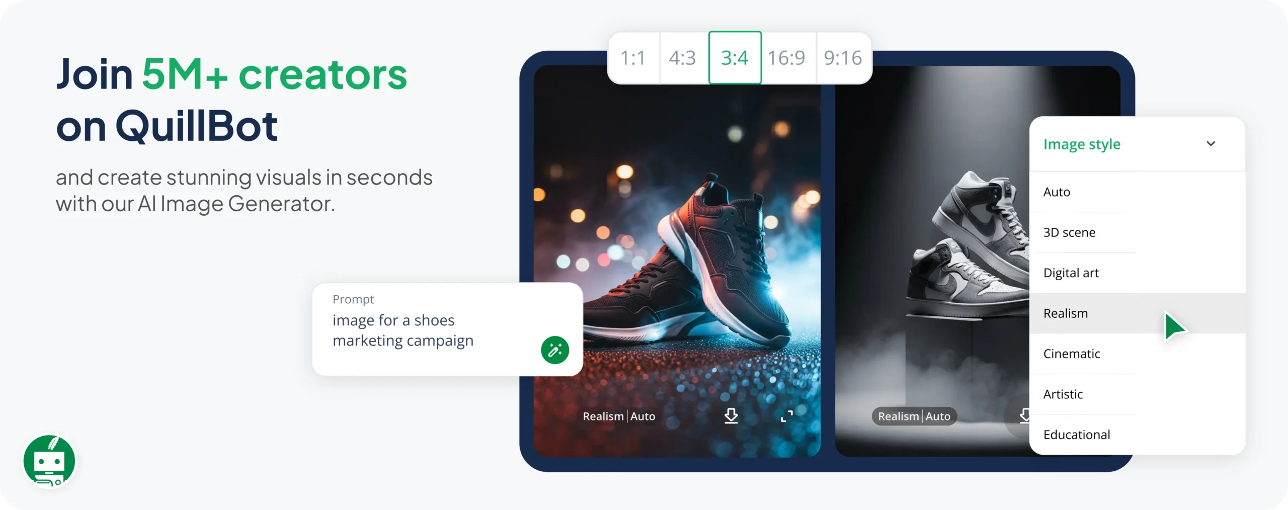


Table of contents
- What is visual identity?
- Why visual identity matters
- Elements of a visual identity
- Logo
- Color palette
- Typography
- Imagery and graphics
- Layout and visual consistency
- Visual identity vs brand identity
- How to create a visual identity
- Ready to build your visual identity?
- Frequently asked questions about visual identity
- Other interesting articles
What is visual identity?
When you see those red and white curves, you know it’s Coca-Cola. You see the swoosh, and you know it’s Nike. This recognition doesn’t come from the name, but from repeated visual signals like color, imagery, and design style, working together over time.
A visual identity suggests mood and personality before a single word is read. While big corporations spend millions on this, every business has a visual identity, whether it was deliberately designed or not. The goal is to make sure yours is working for you, signaling credibility rather than amateurism or irrelevance.

Why visual identity matters
Beyond making a brand look good, visual identity shapes how people experience it in real life through four key pillars:
- Recognition: Consistency helps customers identify your brand instantly, like recognizing the Amazon smile logo on a package before reading the name.
- Trust: People process visuals faster than text. A coherent,thoughtful look suggests professionalism, whereas a scattered identity can create doubt.
- Consistency: A clear identity ensures your brand feels like the “same person” across your website, emails, and social media, quietly building familiarity.
- Differentiation: Different audiences respond to different visual languages. A strong identity ensures you stand out to your specific target market while looking nothing like your competitors.
Elements of a visual identity
A visual identity is made up of several components that work together as a system. Each one helps shape how a brand is recognized and remembered.
Logo
The logo is the main visual symbol associated with a brand. A good logo is defined by several key characteristics:
- Simple: A clean design that is easy to recognize at a glance and easy to remember.
- Versatile: A flexible format that remains clear and professional across all sizes, from a giant billboard to a tiny business card.
- Timeless: A style that avoids passing trends so the brand doesn’t look “dated” within a few years.
- Appropriate: A look and feel that aligns with the specific industry and resonates with the intended audience.
If you’re ready to see how your own ideas look in practice, QuillBot’s AI Logo Generator can help you visualize different concepts instantly.
Color palette
Color shapes how a brand feels before anyone reads a word. Bright colors can feel energetic, while muted tones may appear more refined or calm. To maintain balance, most brand palettes include:
- Primary colors for core recognition and brand identity
- Secondary colors to provide variety and flexibility in design
- Accent colors to highlight key details or important calls to action
Most brands use a defined palette so their website, packaging, social media, and advertisements all feel visually connected.
If you have a primary color in mind for your brand, QuillBot’s free Color Wheel can help you build a complete palette around it. It identifies the perfect matching shades to ensure your website and social posts look professionally coordinated.
Typography
Typography is the set of fonts and text styles a brand uses. Different typefaces create different impressions: serif fonts often feel traditional, while sans-serif fonts tend to feel more modern and minimal. Typography also helps create a recognizable visual style across platforms.
Imagery and graphics
Beyond the logo, a brand is defined by its photography, illustrations, and icons. Whether a brand uses gritty, documentary-style photos or clean, minimalist illustrations, the key is consistency. These elements expand the brand’s visual language, making it recognizable even when the logo isn’t visible.
Layout and visual consistency
Layout is the least obvious element of visual identity, but one of the most felt. How a brand uses space, aligns elements, structures a page, all of it contributes to a recognizable visual rhythm.
Visual identity vs brand identity
While closely related, visual identity and brand identity serve different purposes.
- Visual identity is the outward, visible side of a brand—the elements people instantly recognize.
- Brand identity is the broader foundation; it encompasses not only the visuals but also the brand’s voice, values, and strategic positioning.
| Visual identity | Brand identity | |
| What it is | Visual expression of a brand | Overall personality and strategy of a brand |
| What it includes | Logos, colors, typography, imagery, layouts | Values, mission, voice, messaging, positioning |
| Focus | Appearance and recognition | Meaning and perception |
| Where it lives | Design and visual touchpoints (e.g., websites, packaging, social media, ads) | Communication and overall brand experience |
In other words, while brand identity includes ideas like values, voice, and positioning, visual identity focuses on the elements people can actually see. Both need to work together for a brand to feel consistent and credible.
How to create a visual identity
Here’s a step-by-step guide to building a visual identity from the ground up, using a small handmade soy candle brand as an example.
Step 1: Decide the brand direction
Start by writing down what the brand should feel like. Think in simple terms: calm, warm, natural, minimal, playful, or bold.
Step 2: Create a moodboard
Collect visual references that match the direction you defined. This can include colors, textures, photography styles, typography, and packaging ideas.

Step 3: Define your visual elements
Translate your moodboard into concrete design decisions:
- Logo style
- Color palette
- Typography
- Imagery style


Step 4: Apply it across touchpoints
Use the visual identity in real-world contexts like packaging, social media, website design, and product presentation.

Step 5: Refine in practice
A visual identity becomes stronger once it is used in real contexts. As you apply it across packaging, social media, and your website, you start to notice what feels right and what doesn’t.

Ready to build your visual identity?
Now that you understand how these elements work as a system, you can start bringing your own brand to life. Remember: your visuals are the outward expression of your brand identity, that is, the values and mission that drive your business.
- Define your direction: Select 3–5 core adjectives that describe your brand’s personality and values.
- Visualize your concept: Use tools like QuillBot’s Logo Generator or Image Generator to turn those traits into recognizable symbols and imagery.
- Build your palette: Choose a primary color that evokes the right tone, then use QuillBot’s Color Wheel to build a complete, coordinated palette.
- Maintain consistency: Ensure your visuals and your brand’s voice work together to create a reliable experience for your customers.
Frequently asked questions about visual identity
- What’s the difference between a logo and a visual identity?
-
A logo is a single graphic symbol or wordmark that acts as the “signature” of a business. A visual identity, by contrast, is the broader system that supports that logo. It includes the color palette, typography, imagery style, and layout rules that work together to create a recognizable and consistent look. While a logo is a part of the identity, the identity is the complete visual language.
If you’re feeling stuck on how to bridge the gap between a logo and a full visual identity, QuillBot’s AI Chat can help you brainstorm color meanings, select font pairings, or describe the photography style that best fits your brand.
- Can a small business have a visual identity?
-
Yes, and they should have one. A visual identity isn’t just for global corporations; it’s a vital tool for any small business looking to build trust and look professional. Even a simple, consistent combination of a logo, a specific font, and two or three signature colors can help a small business stand out from competitors and stay memorable to local customers.
If you’re building a visual identity for a small business, you can use QuillBot’s Color Palette Generator to upload an image and instantly extract a set of colors that match your brand’s style.
- How often should a visual identity change?
-
There is no set timeline, but most brands only consider rebranding or a “refresh” every 5 to 10 years. A visual identity should feel timeless, but you might update it if your business expands into new markets, your target audience shifts, or your current look starts to feel dated. The goal is to evolve without losing the recognition you’ve already built with your customers.
If you’re exploring new directions, QuillBot’s Color Wheel can help you experiment with different color harmonies and see how they might work for a refreshed or rebranded visual identity.
Other interesting articles
If you want to know more about colors, letters, or the meaning of emojis, make sure to check out some of our other articles with explanations and examples.Cite this QuillBot article
We encourage the use of reliable sources in all types of writing. You can copy and paste the citation or click the "Cite this article" button to automatically add it to our free Citation Generator.
Nikolopoulou, K. (2026, May 19). What Is Visual Identity & How to Create One. Quillbot. Retrieved May 20, 2026, from https://quilbot.jintools.com/blog/branding/visual-identity/
